
Building a Better Product Page UX for Concern Worldwide’s Gift Shop
Designing a more beautiful, accessible, and functional webpage for all devices

SystemSeed was recently tasked with redesigning and refactoring the UX of Concern Worldwide’s gift site - Concern Gifts.
It was a real joy to work on this project. Outlined below are some of the decisions made as we redesigned and rebuilt the product details page for Concern Gifts, and the reasoning behind them. I’ll be using the Farmyard Bundle page as an example throughout.
Layout
Before the redesign, all content above the fold across device types was basically one massive image, that on many devices expanded beyond the fold line. Below this was a very small and light product title, a brief description, and tiny call to action buttons (CTAs). This meant that a user had to scroll and maybe even squint to read about the gift and find the button that would allow them to buy it.
Photos are obviously very important for product detail pages, and so is descriptive text. Still, “52% of sites don’t use descriptive text or graphics for their top-selling products — which represents a missed opportunity” according to a study from the UX-focused Baymard Institute.
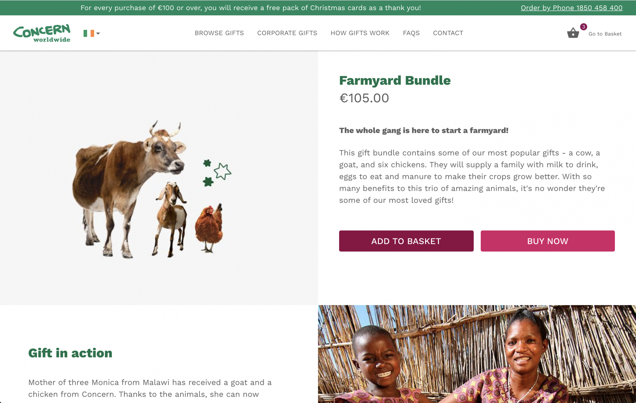
In redesigning the product details page for Concern Gifts, we wanted to keep images at the fore while also making product description and actionable CTAs more prominent and easier to find.
In order to achieve this on desktop we removed the full width images from the top and split the desktop screen into two columns above the fold – a large image to the left, and product title, descriptive text, and bold CTAs to the right:
On lower resolution mobile and tablet devices we didn’t have the necessary screen real estate to use two columns, so we decided to limit the image height and place it at the top. This allowed us to keep the pertinent information and CTAs above the fold on most devices:

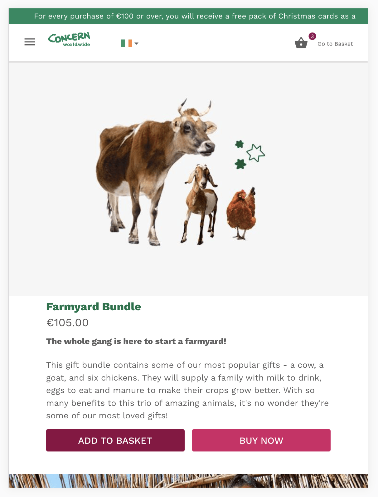
Image, product title, cost, description, and CTAs are the most essential elements of the product details page for each gift. By addressing layout design in a thoughtful manner we were able to present all these elements above the fold on most devices, while still leaving enough space in the designs so that the page doesn’t feel cramped. We also had other page elements to design though - specifically additional information about the gift in action and also what a purchaser receives.
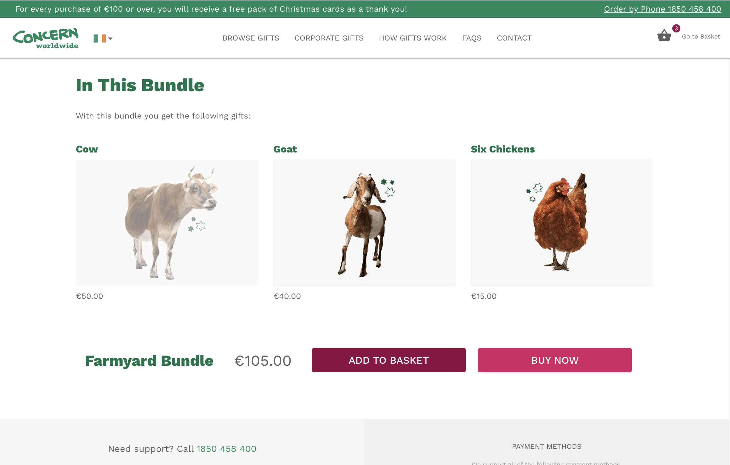
Before the redesign the product page sections “Gift in Action” and “What You Get” lived in horizontal content tabs down the page. For pages that included gift bundles (such as the Farmyard Bundle example shown in this article) there was a third tab for an “In This Bundle” section.
A study from the Baymard Institute found that 27% of users never found core product content that was organized into horizontal tabs. This meant that over a quarter (!) of users were frustrated by the layout and didn’t see information that would have helped them learn more about the product.
With the lack of utility of horizontal tabs in mind, we decided to free the information in these sections. An argument could be made that for very long pages, horizontal tabs could potentially ease user fatigue by shortening page length, but the product pages on Gifts are not particularly long, even with all the information broken out of the tabs. On desktop we used an alternating 2 column layout:

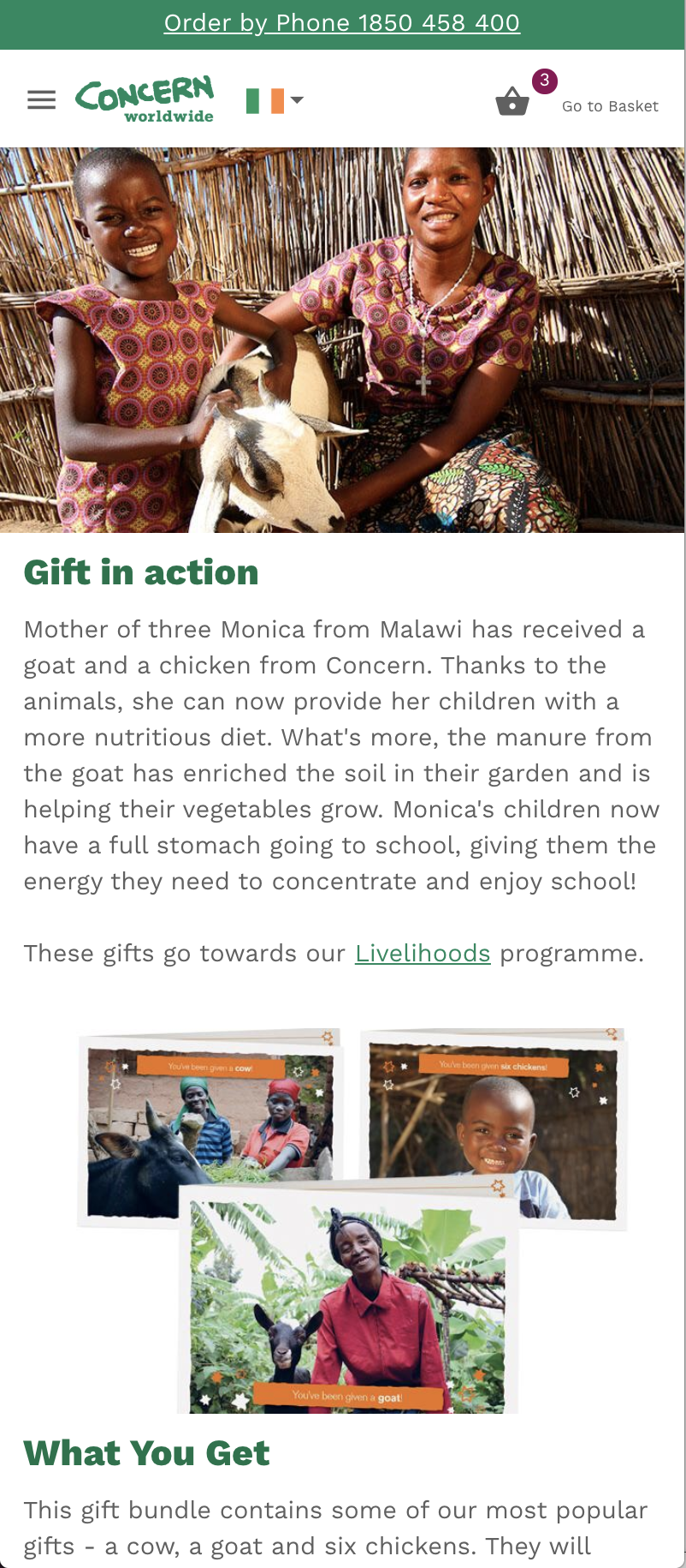
And on mobile and tablet we used images to create natural section breaks:
Finally, we added additional CTAs to the bottom of the page, for ease of access and a second CTA opportunity for users who scrolled all the way down the page. Previous “Add to Basket” and “Buy Now” buttons had a similar green as per the Concern branding, and thus had a tendency to get lost on the page. We updated the CTA button colors to contrast with the brand green, so they could be easily visible and accessible to users.
Typography & Accessibility
The entire Concern Gifts site uses Work Sans, a flexible sans-serif with a variety of weights. The previous build also used Work Sans but missed some opportunities to create a strong typographic hierarchy by limiting type to very thin font weights – for headers, body text, CTA buttons - everything. We decided to tap into the unused potential of Work Sans to build an eye-catching typographic landscape.
We achieved this by using bold header and section header text, with Concern's green brand color, and contrasted that with lighter weight grey text for description and body copy.
The grey for body text used to be much lighter than currently appears on the Gifts site. Light text on a white background can create a more tranquil look and feel for your site, but you run the risk of failing to comply with W3C’s Web Content Accessibility Guidelines for contrast, which will lower the accessibility score for your site (and more importantly lower the site’s overall accessibility).
We darkened the grey and achieved AAA compliance with WCAG while keeping it light enough so that it didn’t feel too heavy. An excellent tool for checking type contrast can be found at WebAIM here.
We really enjoyed redesigning and rebuilding the Concern Gifts product detail page along with the whole Gifts site. Enhancements made to the layout, thoughtfully placed call to actions, a strong and accessible typography hierarchy, and device-specific designing all contributed to a rebuild that we are very proud of. Most importantly, Concern Worldwide were thrilled with the results.
With the holidays around the corner, now is the perfect time to buy a gift for your loved ones or friends and lend a helping hand to those most in need.Visit Concern Gifts today to find the perfect gift.
To learn more about SystemSeed’s approach to UX and design email us at [email protected]