DrupalCon Barcelona - Day 2 Overview
Here’s our quick overview of the second day at DrupalCon Barcelona.
KeyNote
Designers and developers learn plenty of best practices and techniques to get the most out of their websites. From A/B testing to Heat Maps we constantly progress through a course of combined understanding as to how to build the best possible site.
We have come to know more than just basic layout strategies in combination with good information architecture. We now know that the users of the web are affected by basic, general psychology just as in the real world.
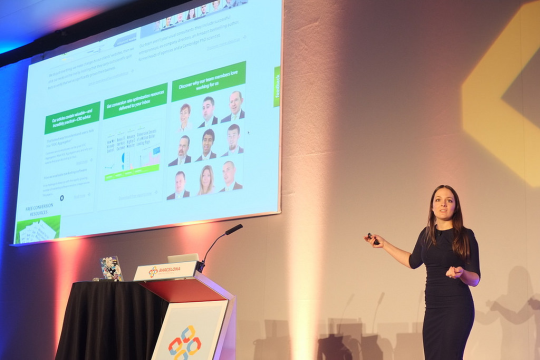
Yesterday’s keynote from Nathalie Nahai explained just this.
Firstly, we are more primal than we acknowledge. Sex sells and we all know it. The use of strong colours such as red, taps into important parts of the brain that initiate fight, flight, or arousal. Designers need to research appropriate use of colour from people like Karen Haller.
Faces, body language, positive affirmation and storytelling all engage users successfully also. This is due to emotional responses rather than rational ones.
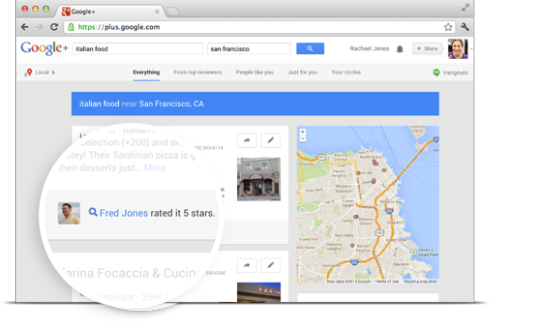
Although there are users that want to be rational, however unnatural that is for us as emotionally led creatures. This audience want to be given hard facts, feature lists backed up with tick symbols, and an array of details uninteresting to the purely emotive audience. That audience often uses social affirmation to confirm and feel good about decision making (asking experts in your personal network for advice). A practical plan for this expected behaviour is to show personal recommendations in the way that Google Maps shows your friends ratings first.
Here are the slides from the session: http://t.co/t8FyyBUtal
Dev Sessions
It’s pretty hard to do objective мodules comparison but we all love it. Webform vs. Entityform is a very well done comparison of form building modules in Drupal. In some cases, Webform is the only choice, but the Entityform module is definitely the future.
“Making Drupal fly” was one of the most awaited Wednesday sessions. Drupal 8 has brand new cache layer with its contexts, tags and cache keys. During the session, Fabian and Wim explained how Drupal 8 cache works, compared it to Drupal 7 and mentioned a couple of pitfalls we should be aware of.
What we really love about Drupalcon is that it’s not limited to Drupal itself. You can learn about dozens of new technologies from one session. “Drupal Extreme Scaling” by Zequi Vazquez is a good example. Apache Mesos, Marathon, Zookeeper, Chronos, Docker, Ansible, Amazon S3/EC2, Node.JS, PostMark, NewRelic… and Drupal. It’s an incomplete list of tools used to run 100k-sites multisite Drupal installation. It’s real extreme!
Another great non-Drupal session was given by Andreu Balius, a type designer from Barcelona. Fonts are important. Even if you’re a total geek you should know that the code written in Courier is very different from the code written in Consolas. Seriously, typography is considered to be one of the most important parts of web design. Andreu used a lot of great metaphors to explain aesthetic and emotional values of different fonts. “What’s your type?” video is already online.
Agile Estimating & Planning
Bluespark’s own Ashleigh Thevenet spoke to the client management portion of DrupalCon attendees about Agile. This is such a common way to develop recently, with the facts firmly in support of Agile when compared to waterfall. However, clients may still see it as vague, risky or too involved. The truth does not reflect these worries but it’s important to explain why.
Firstly, you will have to expect that not all client will want to work this way. If you are not at all open to working in a waterfall way and the client cannot agree to the terms of Agile, then the relationship will not work. It’s important to set your own expectations in this way.
Budgets are often run through several stages internally and have a rationale of their own. This may not be something you can challenge and so if a fixed cap of an Agile project is given, this must result in a flexible scope.
As is common at SystemSeed this is best handled by regular sprint planning calls where we:
- Report on the status of the budget burn vs story points burn in the project as a whole (knowing that we have an all-important fixed cap budget to fall within by the close)
- Constantly check the client priorities in the Product Backlog, having them decide what to move to the top of the list or out to a future phase. Create “buy in” from the client.
- Review the projections. How much is still possible within the fixed budget? On reflection, sometimes the budget can be extended after all!
Client management is key so be transparent and help explain where uncertainties lie early on. It should be understood that any estimations (also to be called “fortune telling!”) should be taken with a healthy pinch of salt. +/- 40% is reasonable before the picture becomes clearer.
At SystemSeed we tend to offer deep dive investigations to help gather details and clarify this for our clients. This usually slims down margins to +/- 20 or 30% and by beginning of the development you should aim to be around +/- 10-15% certainty. This will obviously still change according to any scope creep if that happens throughout the project.
One great suggestion in this talk was the suggestion that in the initial planning phase sketches be drawn up by a UX expert. These shouldn’t be full wireframes but just the basics. Having UX talent on staff allows you to listen, convey options and risks while helping manage expectations from the beginning.
When doesn’t this work?
- Client providing the UX
- Time & Materials projects don’t need every step like this.
Disadvantages:
- Needs client buy in
- Planning meetings can be hard to schedule. Clients can be disinterested in the process.
Watch the session here


