How we designed and built the new SystemSeed.com
An end-to-end explanation including strategy, design, development and base themes.
Our company has changed since our last site was built a little over two years ago. At that time, Anthony and Ev (our now CEO and CTO) had just bought SystemSeed from our founders, Tom and Parrish. This led to the creation of a fresh look site with minimal pages that would allow people looking for us to see a little bit about our range of services, read our latest blog posts, and get in touch with us.
Since then, we’ve both expanded and refined our service offerings, grown the team, and worked to specialise in working with not-for-profit, NGO, government and education clients. It was time for a revamp that would:
- Showcase us and our clients
- Give site visitors a feel of the SystemSeed personality and culture
- Be a useful resource for others
- Deliver great design and UX (as that’s one of the things we offer to clients)
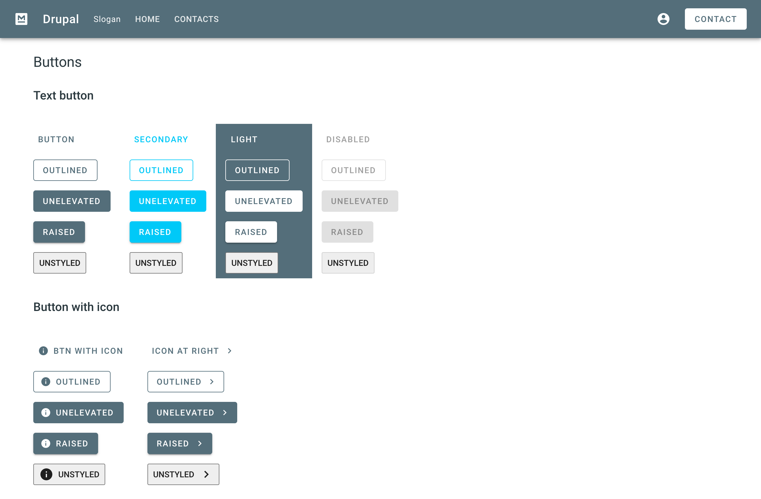
We also wanted to play with a couple of new technical things. The first was to use and improve upon Material Base, a brilliant theme based on Google’s Material design for Drupal by our own Andrey Yurtaev. You can read all about that here.
Secondly, we knew that Drupal 9 was on its way, and we wanted to upgrade to that as soon as we could.
How we did it
Agile
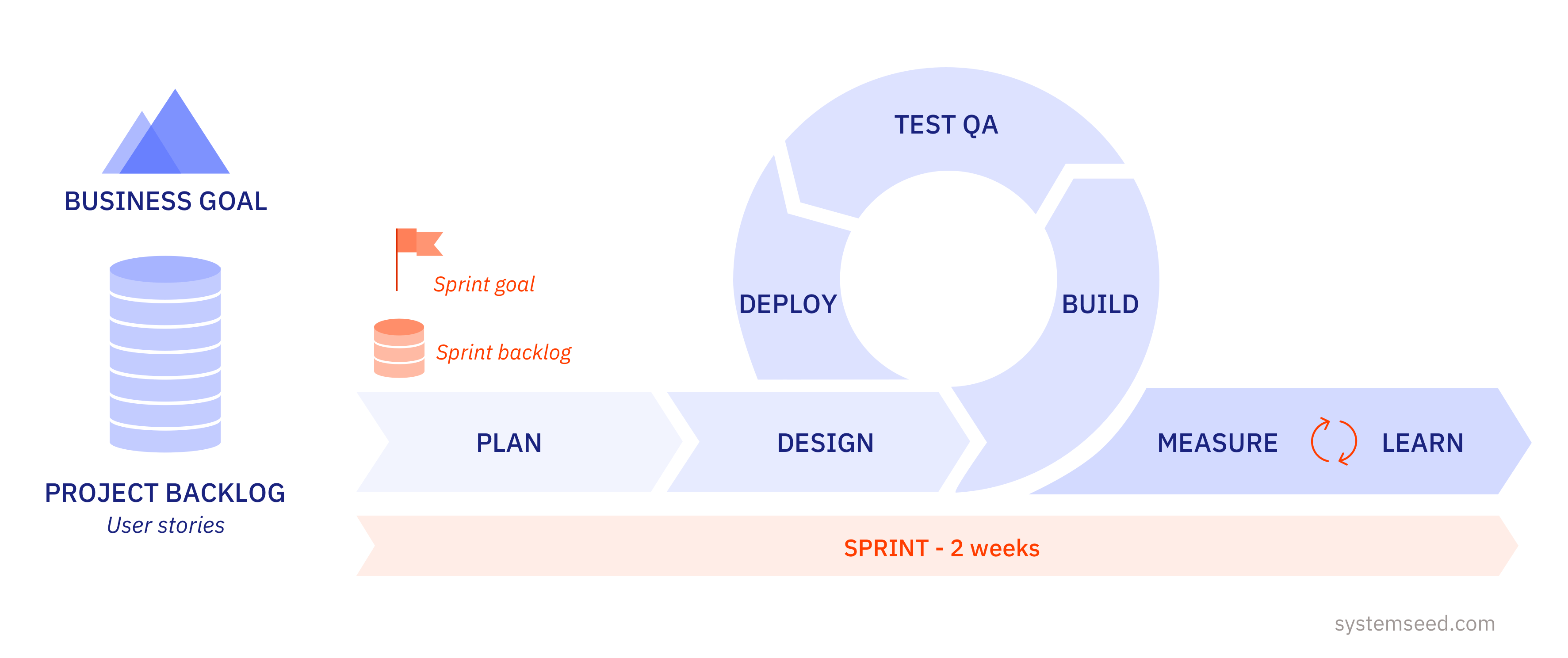
As an organisation that runs all of our client projects using an agile approach, we set up this project to be agile too. We brought our cross-functional team together, set up the project backlog in Pivotal Tracker, and held a kick-off discussion to define our project approach, terms and objectives.
We decided on our SCRUM-based agile ceremonies, with a weekly sprint review and planning as well as daily standups.
Strategy
Competitor review
We had clear objectives for the new site and started by digging into a landscape review. On looking through the sites of agencies of a similar and slightly larger size to us, we noted what we liked and what we didn’t like about each one and put the results in a table. This included site structure, types of information shared, calls to action and page design.
Value tree
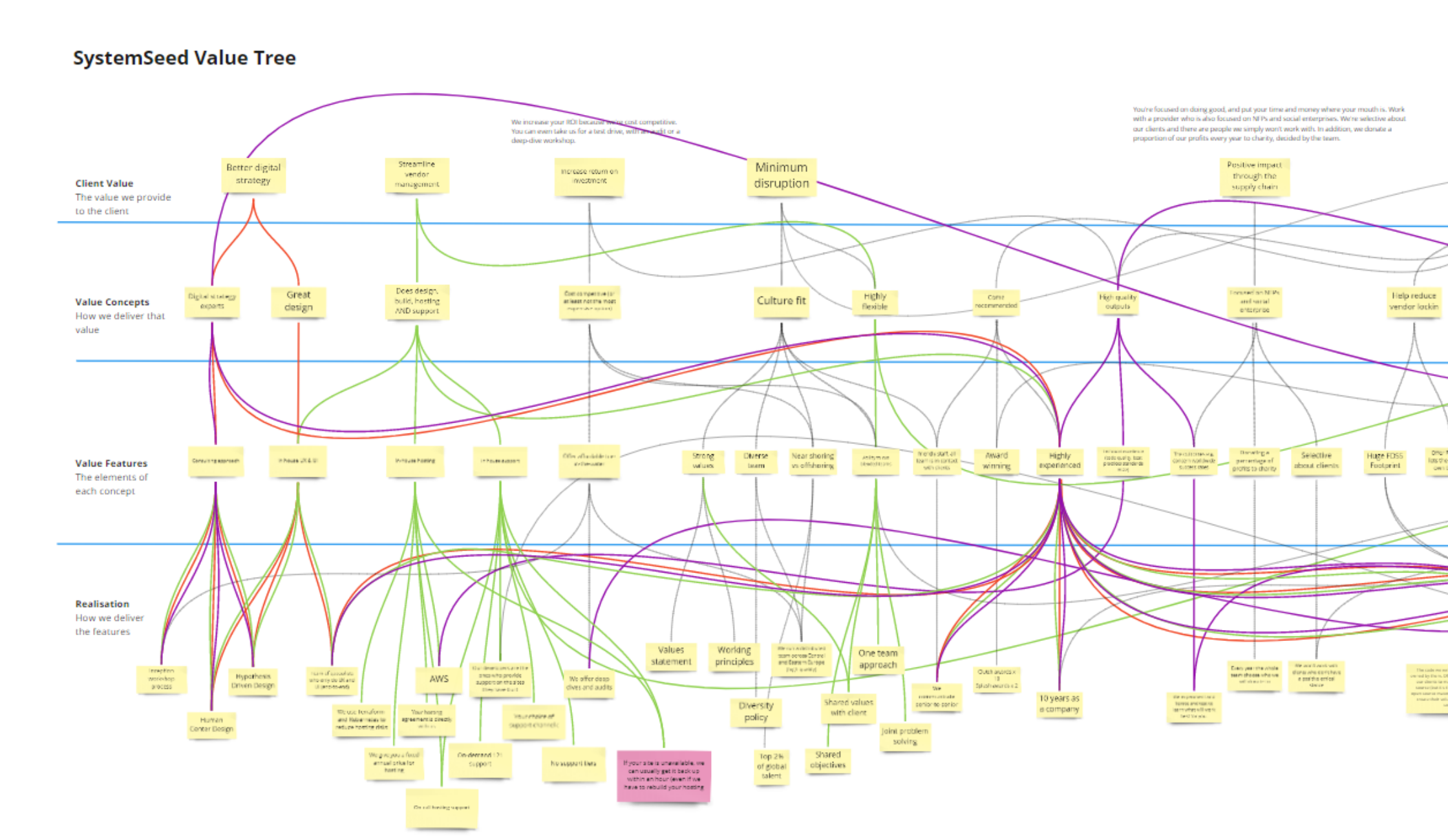
Separately, we created a value tree for our services to help craft our messaging about how what we do helps our clients. It’s a process that would take too long to describe here, so I recommend this article from Magnus Bilgren of Tolpagorni if you’d like to know how to create one.
We created it in Miro, which is an excellent tool for drawing diagrams and flow charts collaboratively.
The outcome of our value tree was a clear way to describe each of our services, how they work, and the benefit to our clients - which we later used to help fill in our site map and write our site content.
Personas
Alongside the value tree, we designed our client personas. These included not only our typical client decision-makers (taking into account the industries we like to work with) but also those who influence them and our community of peers.
We structured our personas using a synthesis of main pain-points, behaviours, goals and gains of our ideal clients.
Site map
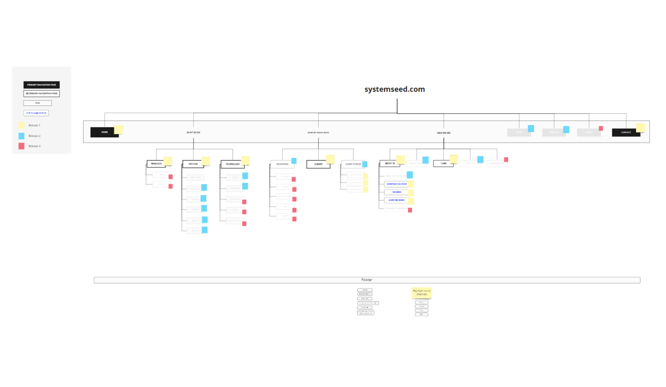
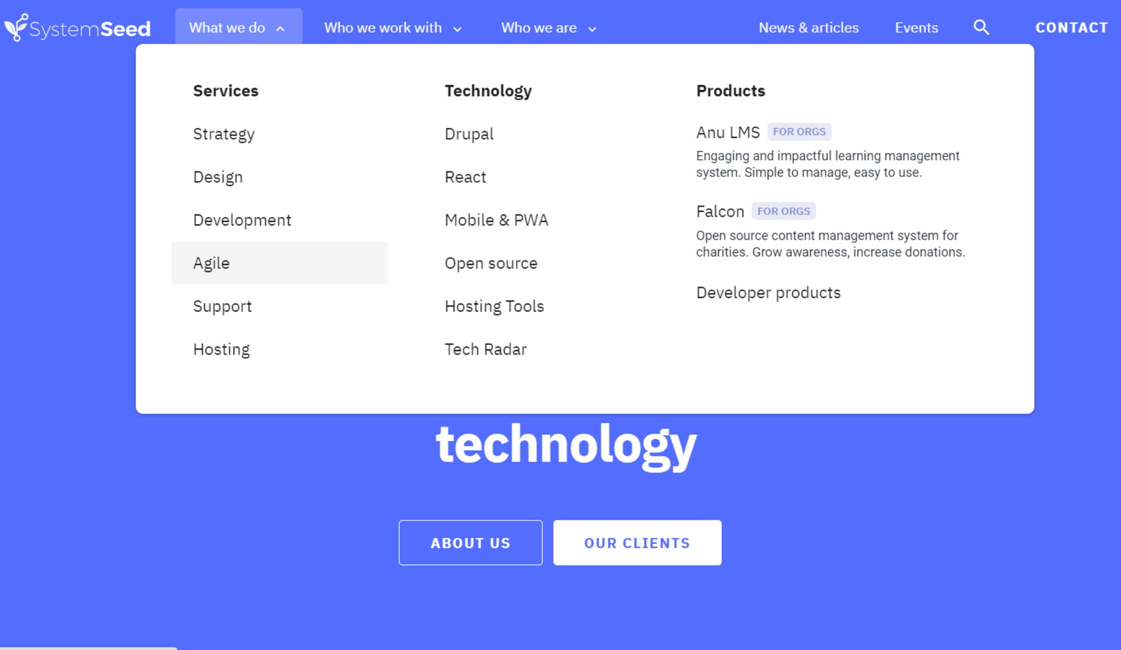
Before beginning any design, we created our site map and categorised each page with a release number. As this was an agile project, we practised what we preach by dividing up pages and some functionality into MVP (minimum viable product), Release 1, Release 2, and Release 3.
This allowed us to release and test with real content before beginning to publicly promote our new site once Release 2 was complete.
The site map became a dynamic document as some items that were intended to be separate pages became sections of a single page, and some pages moved between releases.
Design
Our UX (user experience) focused design process was led by Alejandra Avilés. Working closely with our marketing and development team members, Alejandra delivered design incrementally - just ahead of our developers.
As we were using Material Base as the base theme for the site, Alejandra used Material Design as the basis for the design of our individual site components.
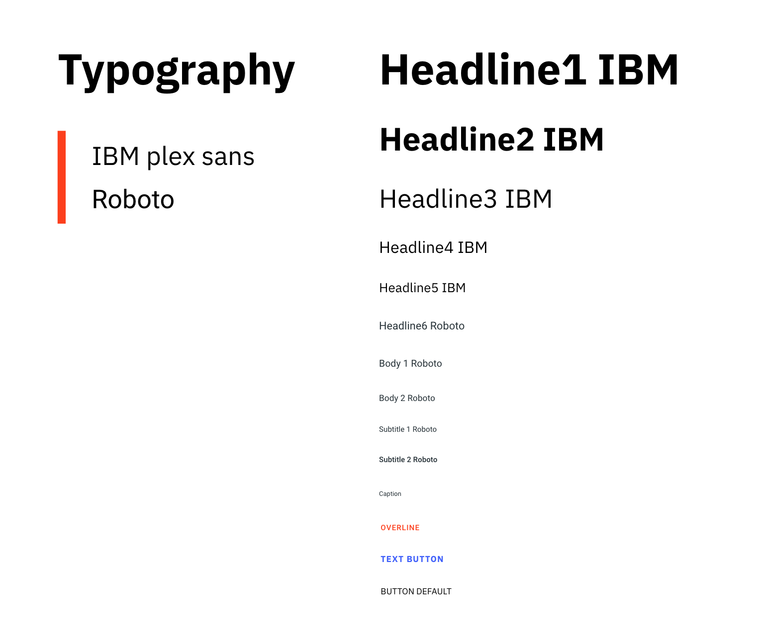
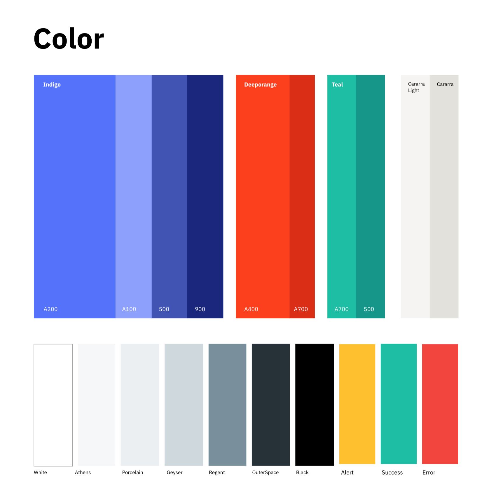
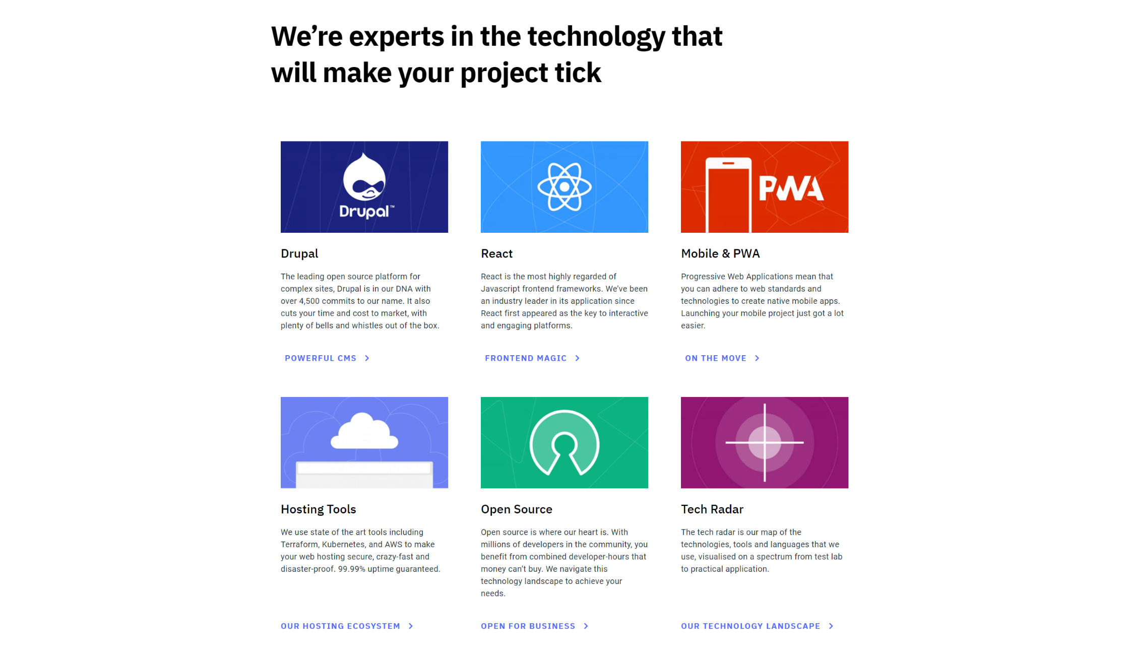
She created new branding for our site with an updated and extended colour palette, as well as new page styling elements and a new custom illustration style.
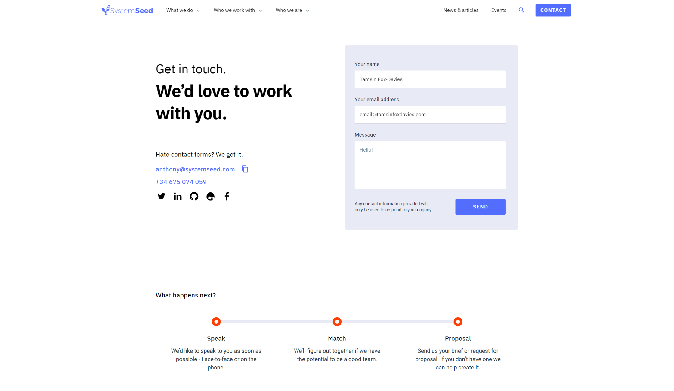
Each new page design was created in discussion with our Head of Growth, Tamsin Fox-Davies, who led the functional and content side of the rebuild project.
For every page, a low-fidelity design was created based on content headlines. The actual content was then written and used to refine design and layout choices.
One of the best things we did with the order of page design was to design one of the simplest pages (Services) first and the homepage last in creating our MVP.
One of the best things we did with the order of page design was to design one of the simplest pages (Services) first and the homepage last in creating our MVP. This meant that we were able to feel out design choices on less design-significant pages first, and only design the homepage (our most important page) last once we had a very clear idea of our new site UX and visual design in line with our iterative visual design process.
Development
Material Base
Usually, all the visual elements of a Drupal site are managed by the site’s theme. Drupal themes (as well as modules) are published on drupal.org and reused on different projects. Some of the themes published on drupal.org already contain layouts and specific styles like colors and fonts. Others are designed in a more generic way, usually without any branded colors or fonts, but containing basic and scaffolding elements which acts as a base for the development of custom themes for individual sites.
These are called ‘base themes’ and save a lot of time on initial development of custom sites, and using the same base theme within multiple projects can also save a lot of time on site maintenance across an agency.
There are several good base themes already published on drupal.org with different approaches and designed for use by developers of different levels of experience but there are very few well supported themes for professional development at the agency level.
We decided to change this, and began to sponsor the ongoing development of Material Base with the intention of using it for SystemSeed.com as well as other projects.
There are a lot of approaches to creating and organising page elements. One of the most popular is to use components and atomic design. Together these should provide significant benefits for fast reuse and creation of new pages from existing components, as well as easier maintenance.
The intention is good, but there are not many effective examples of the theory in action, so we decided to develop our own base theme, with its own set of components, and make them reusable for other projects. We combined the power of Drupal theming with the Material Design Components library. This allows us to use elements (like buttons) in their default variants, customise them, or use completely custom elements instead.
As a result, in Material Base we now have about 15 basic generic elements, 30 page blocks created from basic elements, and a well-standardized way of using them. Site colors, fonts, and sizes are set as variables, and all our components used these values to create the final look and feel.
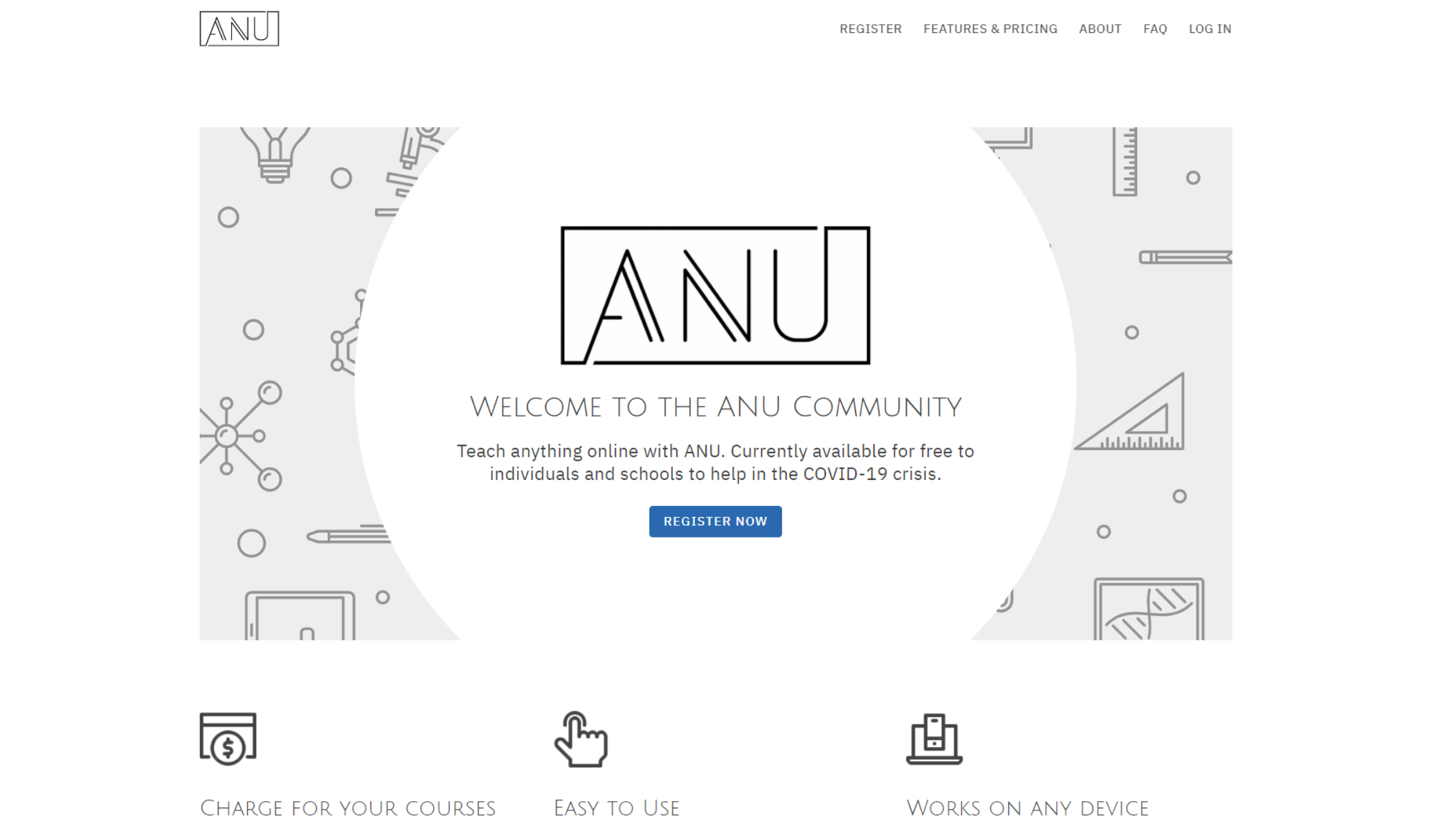
Since releasing the new SystemSeed.com, we’ve also applied Material Base to our ANU.Community site and it was a fast and effective implementation.
Paragraphs and page templates
Paragraphs is one of the most popular Drupal contributed modules and it provides real power and flexibility in creating a great content editing experience. Instead of writing HTML markup, Paragraphs provides a set of fields to add simple values or select a value from a list. Using the proper Paragraphs structure is also important to maintain the balance of flexibility and number of paragraphs.
We extended the functionality of Paragraphs by adding modules to make content editing cleaner and more user-friendly, as well as providing templates for the most frequently used elements and pages designs.
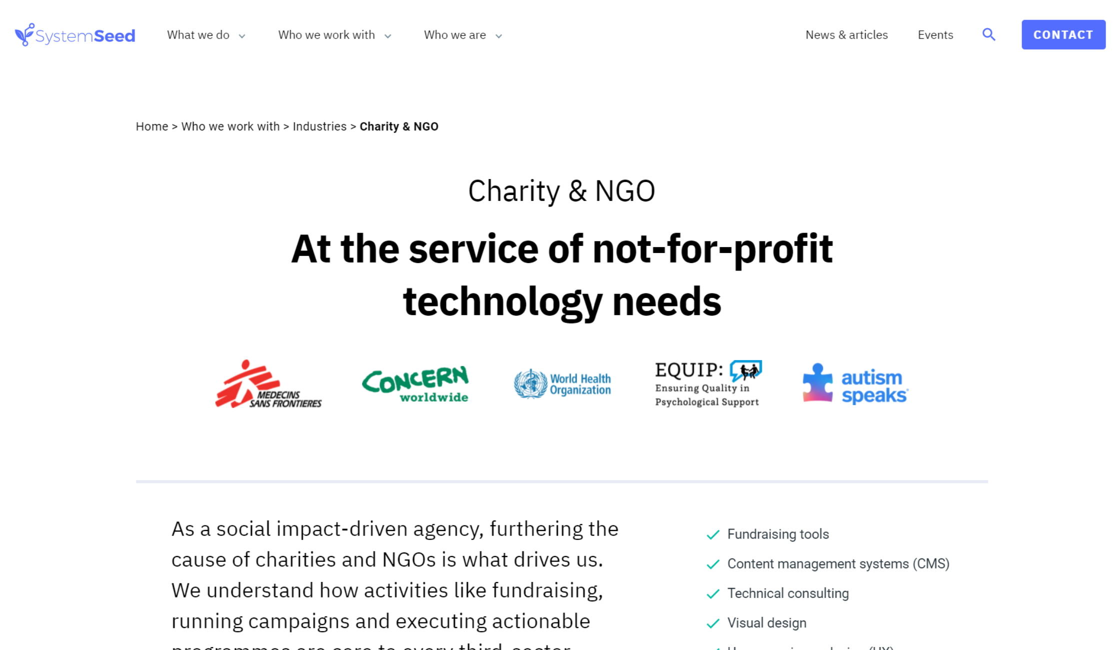
In combination, this allows content editors to very quickly create new pages without additional development - and that’s not just for classic blog-type content. Our Client Stories, Services, Technologies, and Industries sections all have common page styles and can be added by content editors through the admin panel.
Upgrading to Drupal 9
When we began development on SystemSeed.com, Drupal 9 hadn’t yet been released so we used Drupal 8 through the MVP release. We knew that upgrading from Drupal 8 to Drupal 9 should be straightforward, because new major Drupal releases are designed with an upgrade path and to avoid breaking changes. We had plans to upgrade to Drupal 9 as soon as it was released and achieved that within two weeks of Drupal 9 being available. You can read more about that here.
Upgrading to Drupal 9 didn't give us any new features or significant changes from the user's point of view, but it was important for future development and maintenance to be on the cutting edge of Drupal development. It has also given us good experience for upgrading client sites and projects as needed.
Results
Traffic
We didn’t expect a high traffic volume on releasing our MVP site - especially as we were doing nothing to promote it at that time - but we were happy to see an instant increase in overall site traffic.
From the screenshot below, you’ll see that the traffic for our previous site hit 25 users on a good day through March and early April this year. When we moved to our new site in mid-April, numbers shot up immediately and we now receive hundreds of hits several days a week.
This was particularly gratifying as we haven’t yet implemented much in the way of SEO (search engine optimisation), beyond the site structure itself.
Although our bounce rate has gone up by 35% since March, we’re not concerned about that as the average session duration has increased by 184% over the same time period.
Feedback
We asked for feedback from a few existing clients and contacts on release of our MVP, which was very helpful. Predominantly the feedback was positive, particularly around look and feel, and ease of navigation.
We received constructive suggestions on some of our use of colour (we went a bit overboard on our hero block backgrounds in the beginning), and some of our UI behaviours (whether items should or shouldn’t be clickable), as well as a few typo catches.
Additionally, we’ve already received inbound enquiries from potential clients who said they particularly responded to the ease of navigation of the site and our clear emphasis on working with not-for-profit organisations.
Proof of concept
As mentioned previously, we used the creation of SystemSeed.com as a way to test and further develop Material Base. We’ve been very pleased with the results and early experiments with some of our other sites have proven that it is the flexible and powerful base theme that we’d hoped for.
Implementing Material Base on the ANU.Community site took just four days and Material Base has now also been implemented on three sites that we have developed for the World Health Organisation.
On each occasion, getting up and running with Material Base was quick and easy, which means that uncomplicated projects can now be launched in a couple of days simply by using Material Base - and that’s something we’re extremely proud of.

