User-friendly admin experiences in Drupal
A group conversation at DrupalCon Lille 2023
DrupalCons (the annual Drupal conferences) include a session format called Birds of a Feather, or BoF for short. At the 2023 European DrupalCon in Lille, SystemSeed product designer, Mike Gyi, hosted a BoF on the topic of improving the Drupal admin experience through the use of widgets and guidance text.
We hosted an engaging round table discussion where DrupalCon attendees from many different professional roles came together to talk about creating user-friendly Drupal admin experiences.
Beginning with the Claro admin theme, which is much cleaner and more simple than previous Drupal admin themes, we demonstrated how SystemSeed uses advanced UX elements to enhance the admin experience for different user types.
At SystemSeed, we lead all of our projects with UX and focus specifically on the needs of a project’s priority users. In terms of admin users, these could be content editors, translators, or site managers.
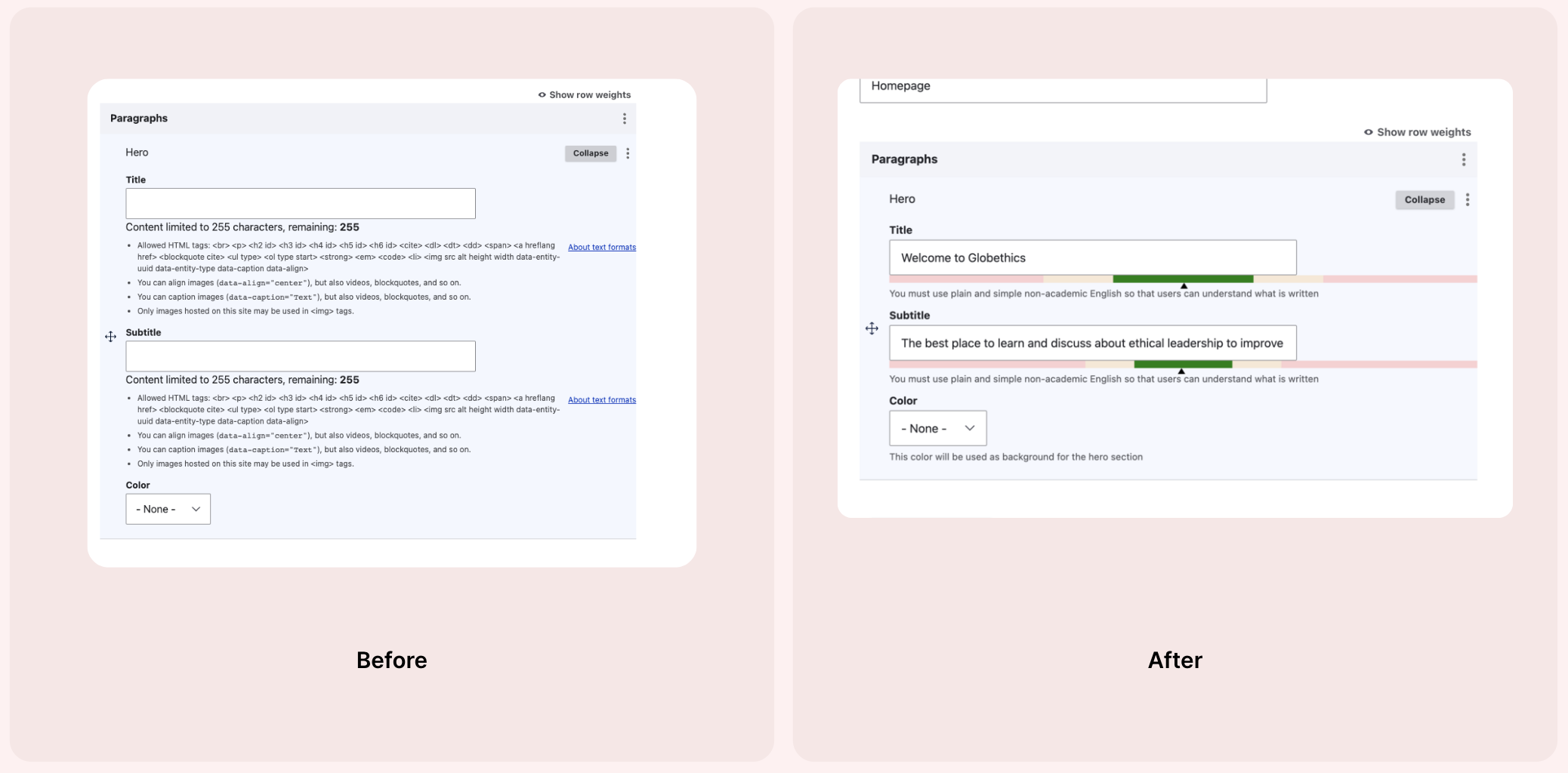
In our experience, admin users get the best user experience from a combination of guidance text and widgets.
However, when the guidance is streamlined, as with the example on the right, it becomes easier for admin users to understand and comply with. We minimised the guidance text and used a widget with red, amber, green indicators to show when the content fitted with the guidance.
This clean and highly visual change made the site much easier to manage for content admins, proving the adage that with UX design ‘less is more’.
The consensus of the discussion was that the best way to design a good admin experience, is to question every piece of information on the screen and delete or hide interface elements where necessary.
One participant in the room had a team of 250 content admins and explained how hard it is to control how they use the admin UI (user interface). They mentioned that their admins don’t read guidance and require a lot of training.
Another participant mentioned that they had done a lot of customisation on their admin experience, including the use of tooltips and how-to-guide directly within Drupal.
My takeaway from the conversation, is that everyone is doing something different in Drupal to improve the admin experience. These changes range from small adjustments to large wholesale changes to the Drupal admin.
All approaches seemed to be working to different extents, and there is no single approach that is favoured more than others across the organisations represented in our discussion.
Interested in improving your admin UX?
Get in touch with us directly to hear more and learn how we can help redesign your Drupal admin experience to help your priority admin users.


